Amazon Devices was established in 2007 with the release of the very first Kindle. Over the years, other brands were added, including Echo, Fire TV, Fire Tablets, Dash, and Smart Home. However, Devices as a whole was lacking cohesion in its marketing. Because no unifying standards existed, each sub-brand was establishing itself differently: this resulted in a confusing customer experience, directionless visuals, and a weakened Devices brand overall.
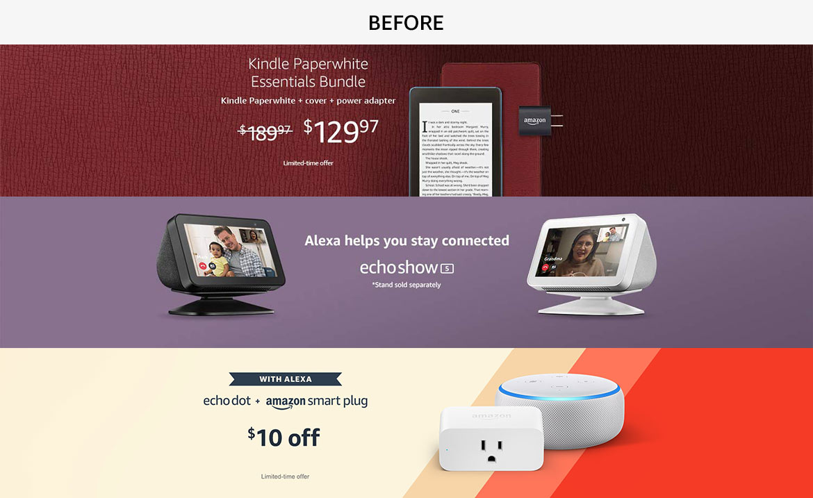
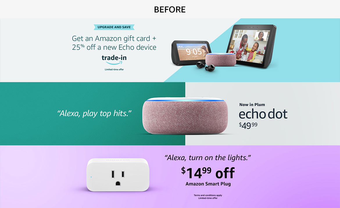
In order to solve this, I created the first annual style guide that resulted in a consistent look and feel across all touch points of merchandizing creative, including aesthetics, styling, and typesetting.
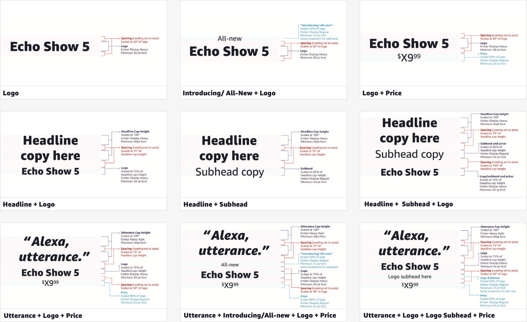
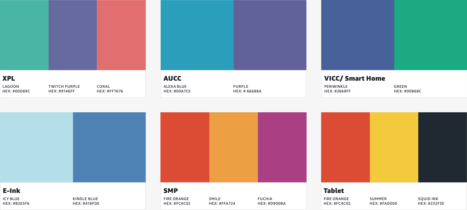
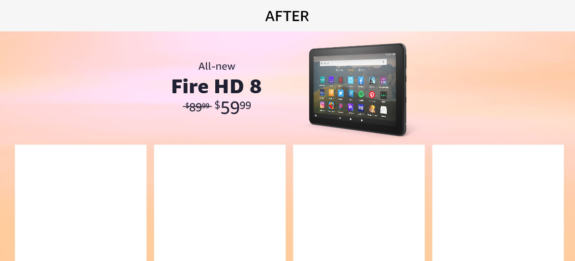
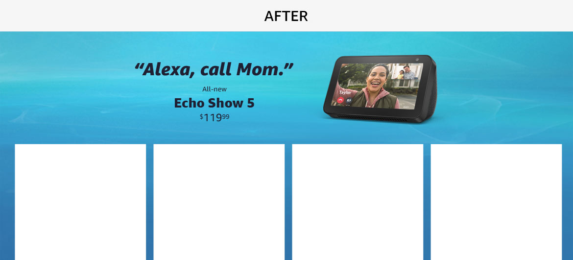
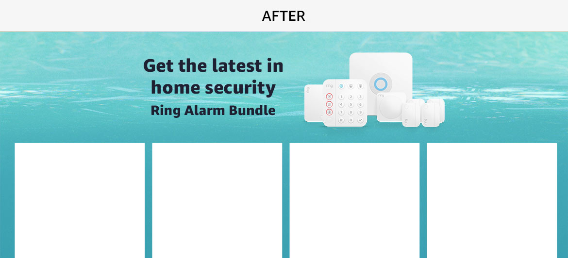
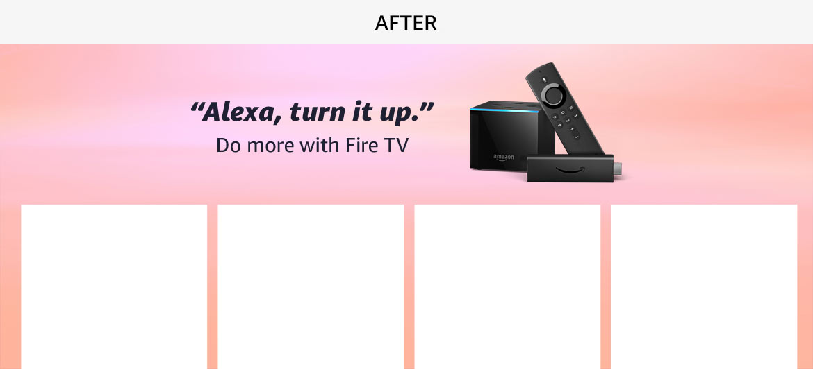
I started by choosing typography and establishing typesetting and styling rules. I then looked at each sub-brand and created color palettes that would be integrated into the backgrounds, increasing in saturation throughout the year.
For visuals, we decided to have three options per quarter, and utilize the theme of light. Taking prismatic refractions, I worked with a CG team to generate visuals reminiscent of each season. For colder months, this showed up as light glistening on shattered ice, aurora borealis lights, and snow flakes. For warmer months, it showed up as rays of sun reflecting off an inviting pool, a sunset, and stars shining in a clear night sky.


Upon completion, I oversaw implementation into automation tools and handmade templates in North America, and eventually the expansion to Europe and rest of world. Overall, on-site marketers saw an immediate uptick in customer engagement and conversion when using the new look and feel.